Sticky Add to Cart User Guide
Everything you need to set up, customize, and optimize the persistent Add to Cart bar on your BigCommerce store — no coding required.
- Estimated 12 min read
- Last updated: February 2025
Introduction
Sticky Add to Cart is a BigCommerce app that adds a persistent, fully customizable "Add to Cart" bar to every product page on your store. As shoppers scroll down the page, the bar stays visible — keeping the purchase action always within reach and reducing friction at the most critical point of the buying journey.
With a powerful visual configurator, real-time live preview, and zero coding required, you can match the bar's look and behavior exactly to your brand — in minutes.
With a powerful visual configurator, real-time live preview, and zero coding required, you can match the bar's look and behavior exactly to your brand — in minutes.
Boost Conversions
Eliminate the need for shoppers to scroll back up to add items to their cart.
Fully Customizable
Colors, fonts, shadows, gradients, and button styles — all under your control.
Element Control
Choose which elements appear and in what order — image, title, price, variants, quantity, and button.
Live Preview
Preview every change in real time before publishing to your live storefront.
Getting Started
Setting up Sticky Add to Cart takes just a few minutes. Follow these four steps to get your bar live on your store.
1. Install the App
- Visit the BigCommerce App Marketplace and search for Sticky Add to Cart.
- Click Get This App and follow the on-screen prompts to install it to your store.
- Once installed, the app will appear under Apps in your BigCommerce control panel.
- Click Get This App and follow the on-screen prompts to install it to your store.
- Once installed, the app will appear under Apps in your BigCommerce control panel.
2. Open the App
- From your BigCommerce control panel, navigate to Apps › My apps.
- Click on Sticky Add to Cart to launch the app dashboard.
- Click on Sticky Add to Cart to launch the app dashboard.
3. Configure Your Bar
The dashboard opens directly to the configuration panel. Use the three tabs — Styling, Layout, and Behavior — to customize the sticky bar to your preferences. Every change is reflected instantly in the Live Preview panel on the right.
4. Save & Go Live
Once you are satisfied with your configuration, click Save Changes. The app will automatically install the bar on all product pages of your store — no theme edits or code changes required.
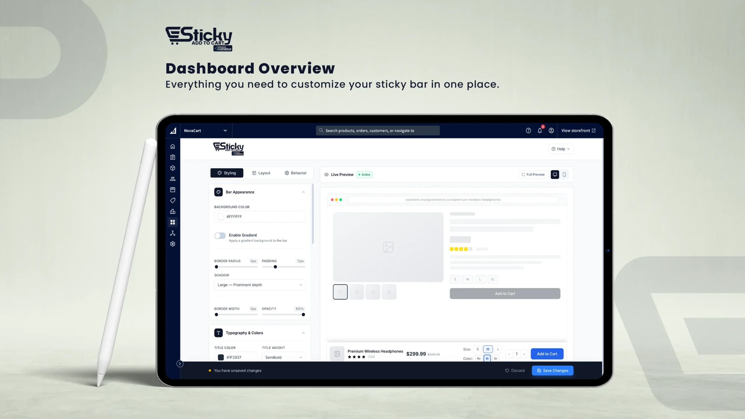
Dashboard Overview
The dashboard is divided into four main areas:
Left — Configuration Panel
Contains three tabs: Styling, Layout and Styling, Layout Behavior.
Each tab groups related settings into collapsible section cards.
Right — Live Preview
Displays a simulated product page with your sticky bar applied in real time. Toggle between Desktop and Mobile views.
Top — Header
Displays the app logo and a Help button. Clicking "Help" reveals the app version number and support contact email.
Bottom — Save Bar
Whenever you make changes, a floating save bar appears with Save Changes or Discard options.
Styling Tab
The Styling tab controls the visual appearance of the sticky bar, including its background, typography, button design, and individual element styles.
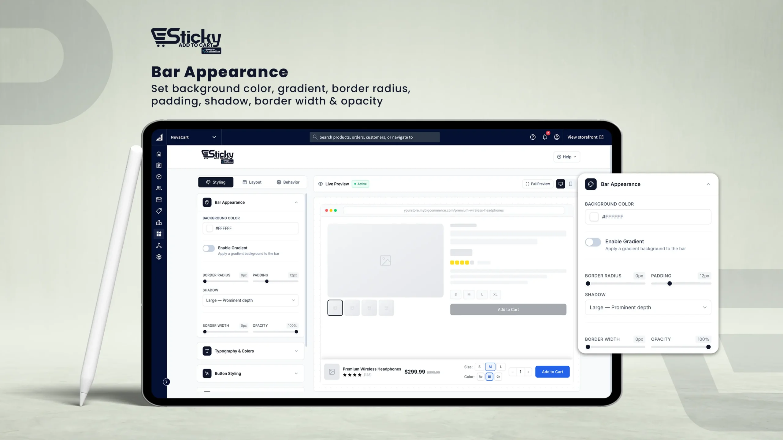
Bar Appearance
Background Color
Sets the solid background color of the bar. Click the color swatch to open the color picker.
Enable Gradient
Toggle on to replace the solid background with a two-color gradient. When enabled, configure Gradient From, Gradient To, and Direction (Horizontal, Vertical, or Diagonal).
Border Radius
Rounds the corners of the bar (0–30px).
Padding
Controls internal spacing between the bar's edge and its content (4px–32px).
Shadow
Adds a drop shadow for depth. Options: None, Small, Medium, Large, Extra Large.
Border Width
Thickness of a border around the bar (0–5px). When above 0, a Border Color picker appears.
Opacity
Controls the transparency of the entire bar (20%–100%).
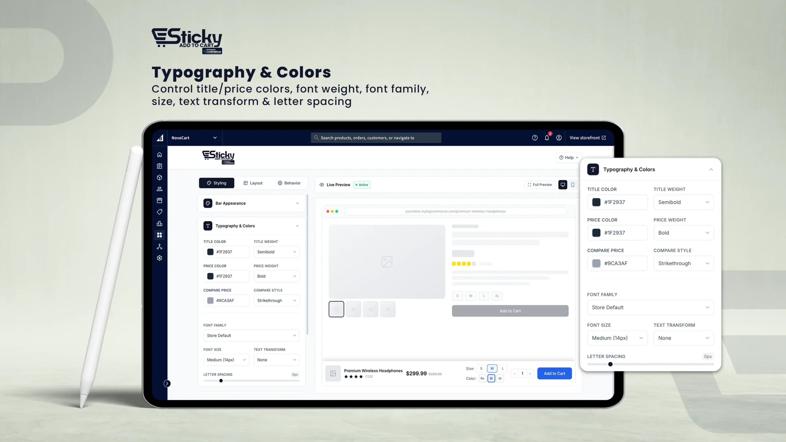
Typography & Colors
Title Color
Sets the color of the product name displayed in the bar.
Title Weight
Font weight: Light, Normal, Medium, Semibold, Bold, Extra Bold.
Price Color
Sets the color of the current (selling) price.
Compare Style
Strikethrough (line through original price) or Sale Badge (colored discount badge, e.g., -25%).
Font Family
Store Default, System UI, Inter, Roboto, Open Sans, Lato, Montserrat, Poppins, Georgia, Playfair Display, Segoe UI, Arial.
Font Size
Base font size: XS (11px) to XXL (20px).
Text Transform
None, UPPERCASE, lowercase, or Capitalize.
Letter Spacing
Adjusts character spacing (-1px to 5px).
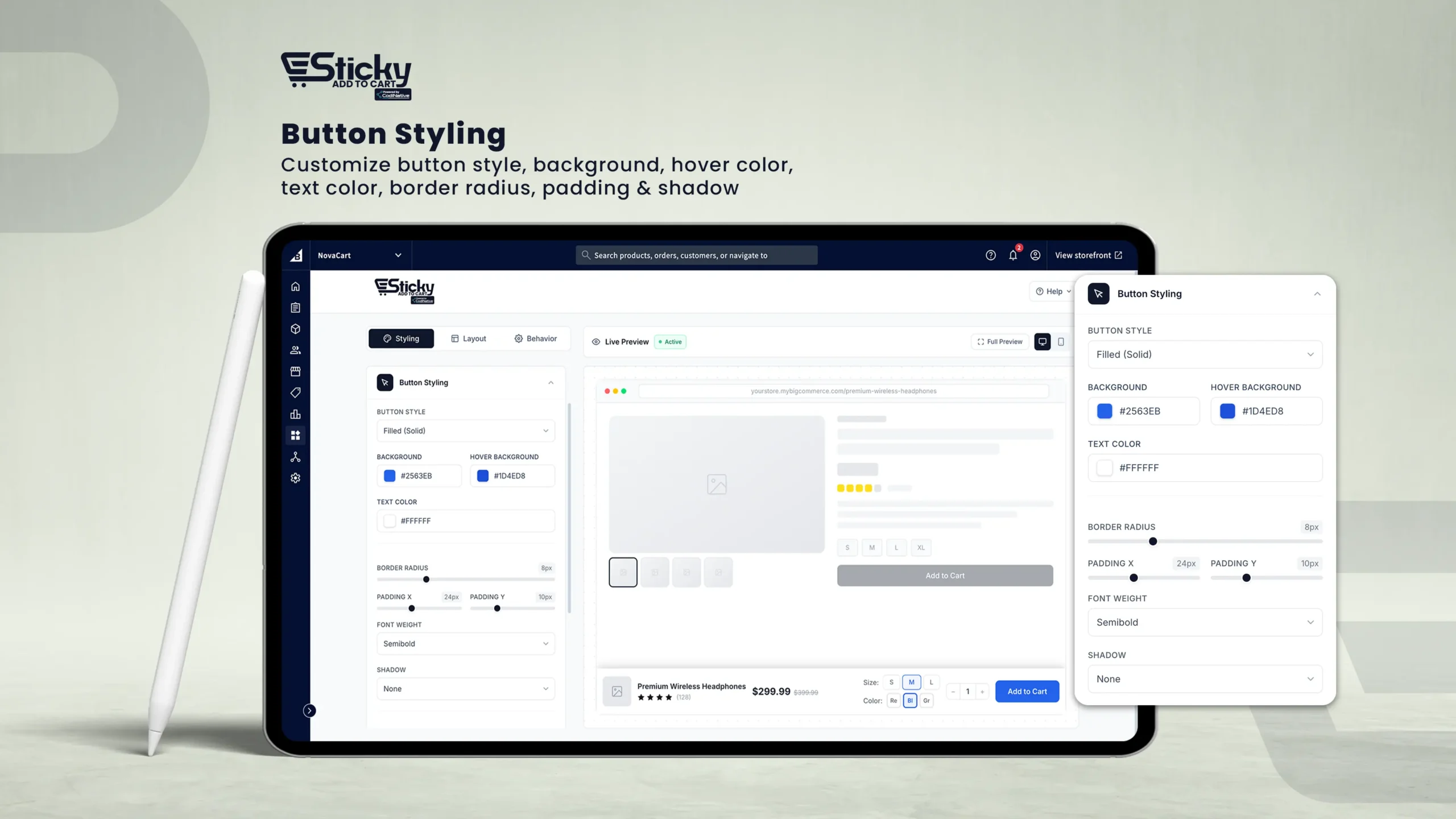
Button Styling
Button Style
Filled (Solid), Outline, Pill Shape, or Ghost (Transparent).
Background Color
The button's fill color.
Hover Background
The color the button transitions to when hovered.
Text Color
The color of the button label text.
Border Radius
Rounds the button corners (0–30px).
Button Text
Customize the label on the button (default: "Add to Cart").
Show Cart Icon
Toggle on to display a shopping cart icon alongside the button label.
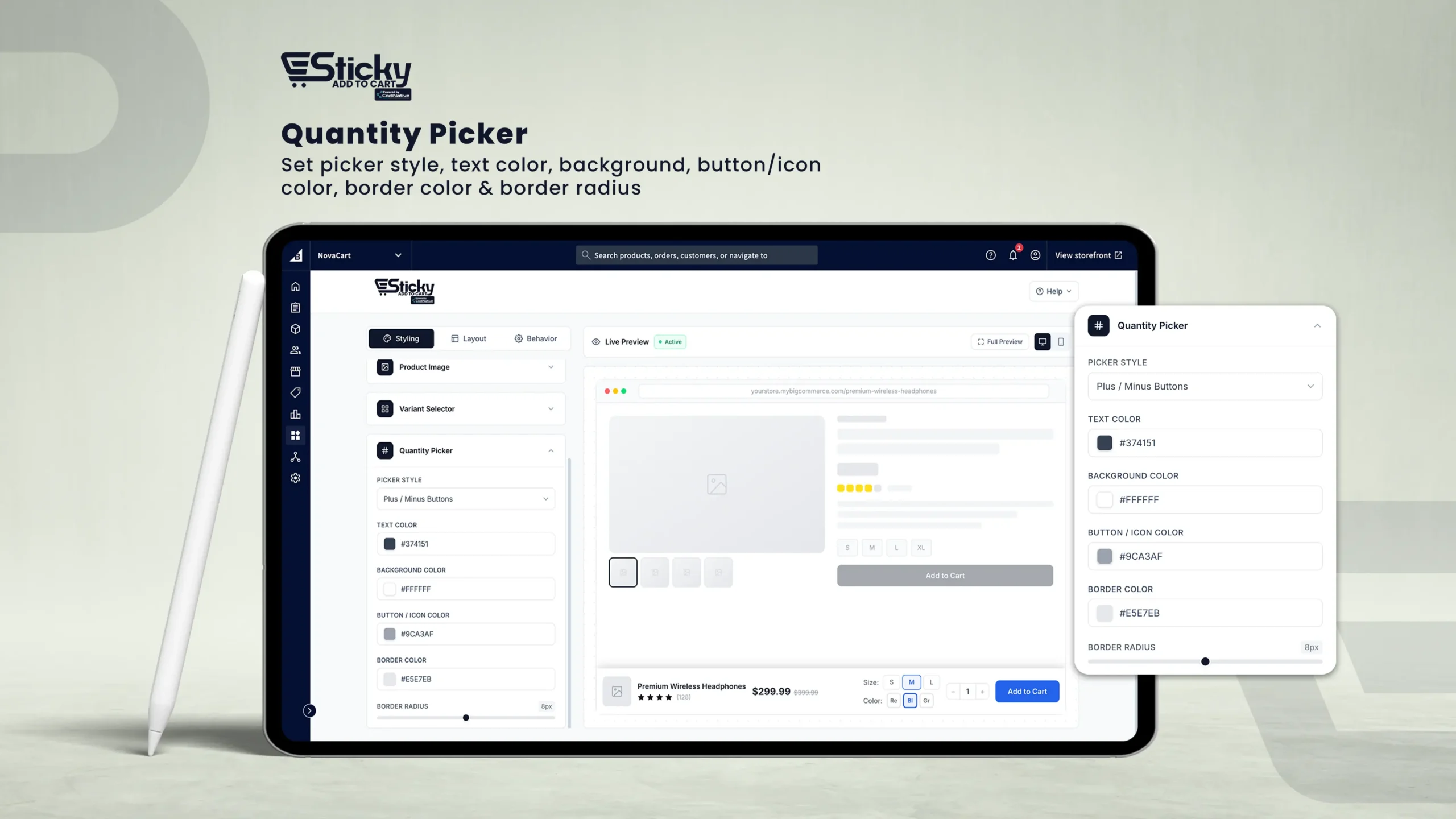
Product Image
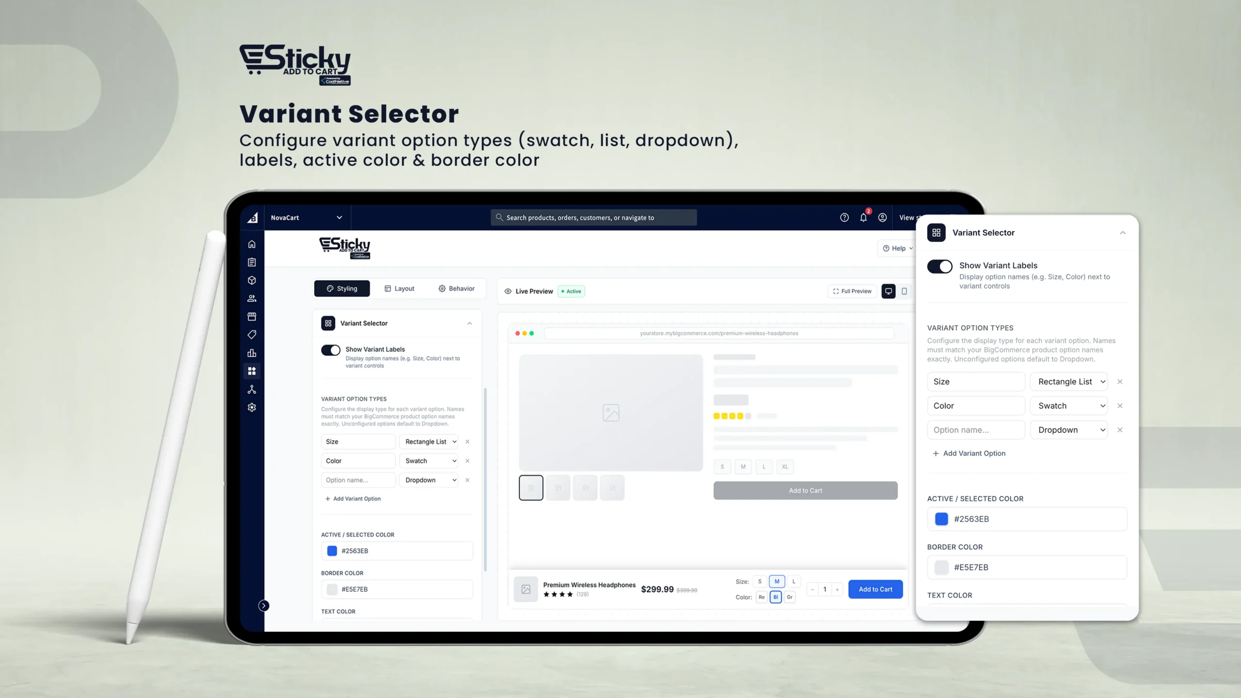
Variant Selector
Show Variant Labels
Toggle on to display the option name (e.g., "Size:", "Color:") beside each variant control.
Variant Option Types
Display style per option: Dropdown, Swatch, Radio Buttons, or Rectangle List.
Active / Selected Color
The highlight color applied to the currently selected variant value.
Border Radius
Rounds the corners of variant controls (0–16px).
Click + Add Variant Option to configure additional options. Options not configured will default to the Dropdown display type.
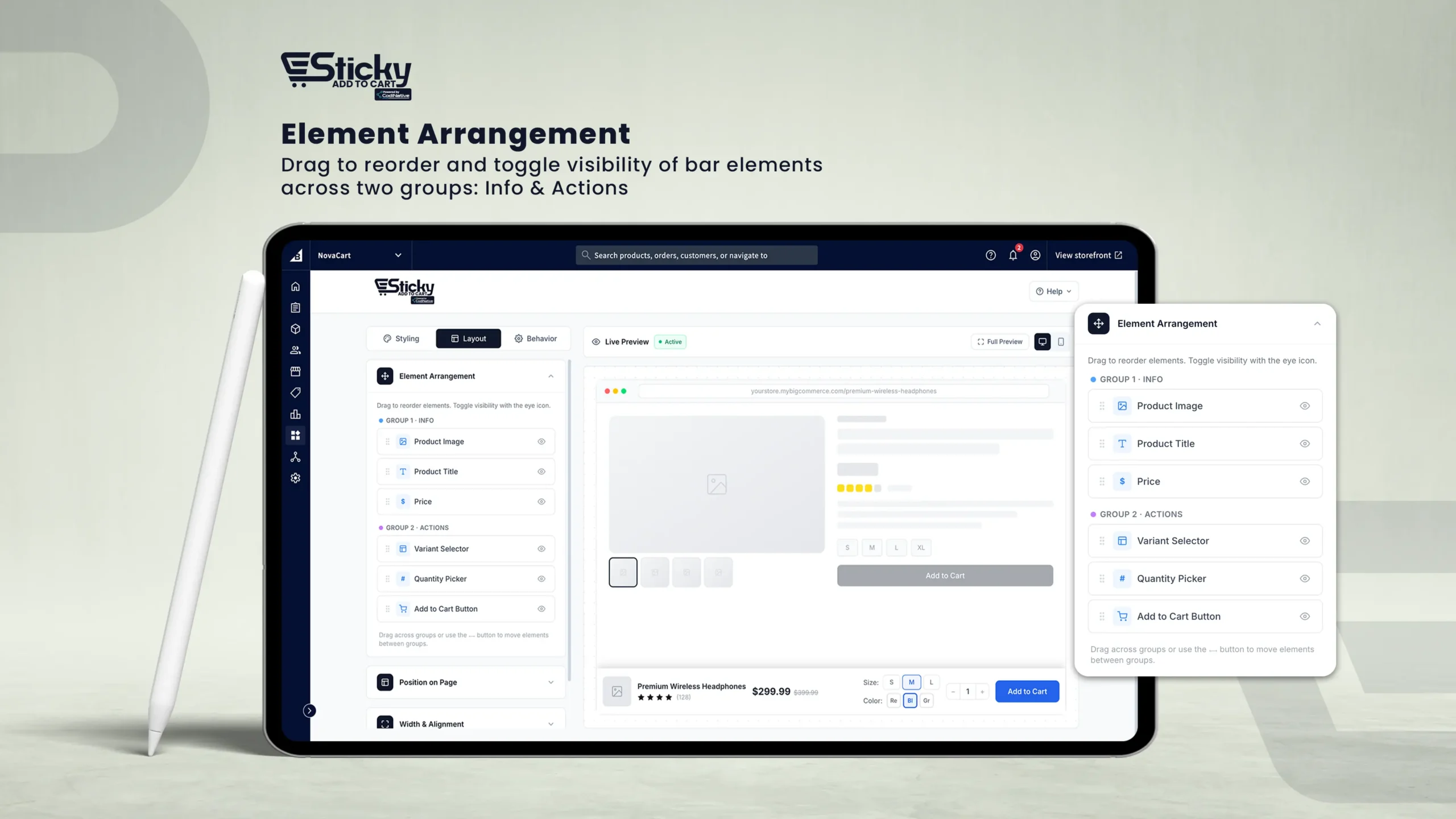
Layout Tab
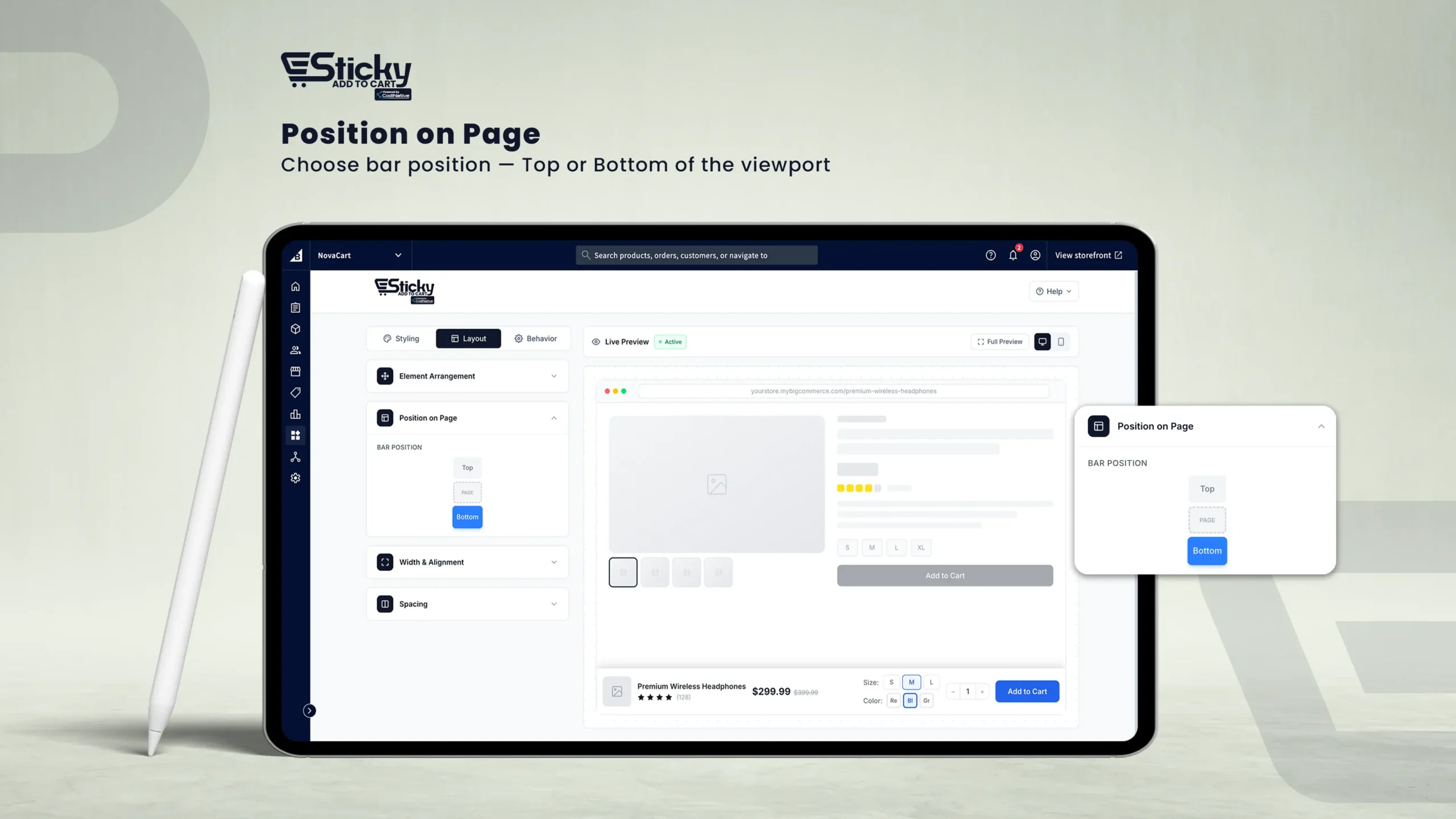
The Layout tab controls the structure of the sticky bar — what elements appear, where the bar sits on the page, how wide it is, and how content is spaced.
Element Arrangement
Position on Page
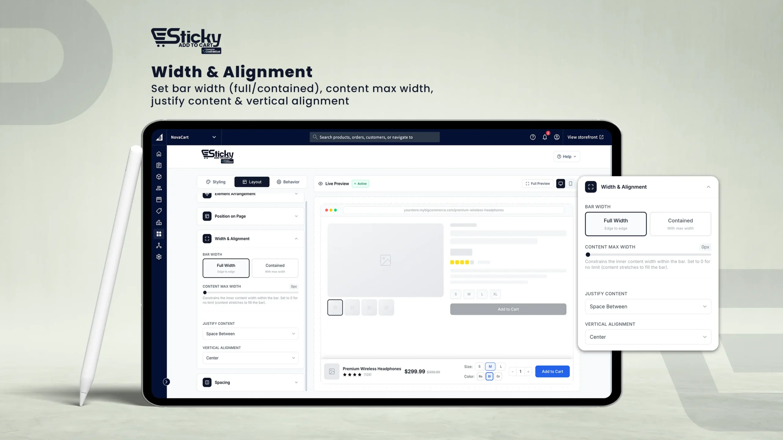
Width & Alignment
Bar Width
Full Width (edge to edge) or Contained (max-width constrained, 600px–1800px).
Content Max Width
Limits the width of the inner content area. Set to 0 for no limit.
Justify Content
Start, Center, End, Space Between, Space Around, Space Evenly.
Vertical Alignment
Top, Center, or Bottom alignment within the bar.
Spacing
Behavior Tab
The Behavior tab controls when and how the sticky bar appears, how it animates, how it reacts after items are added to the cart, and how it behaves on mobile devices.
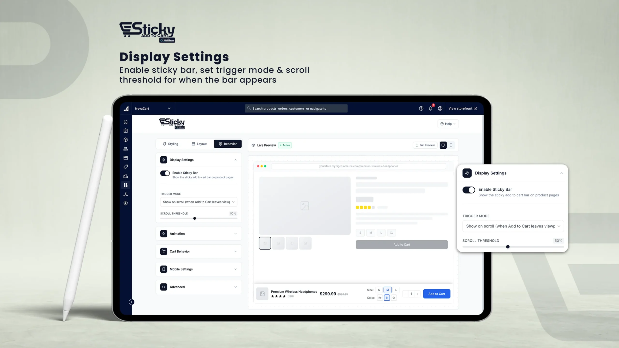
Display Settings
Enable Sticky Bar
Master toggle to show or hide the sticky bar across your entire store.
Trigger Mode
Show on scroll (after original ATC leaves viewport), Always visible, or Show after time delay (0–30s).
Scroll Threshold
Percentage of page to scroll before the bar appears (10%–100%).
Show Close Button
Toggle on to display an "×" dismiss button with configurable close behavior: Hide temporarily, Hide until page scrolled again, or Hide for entire session.
Animation
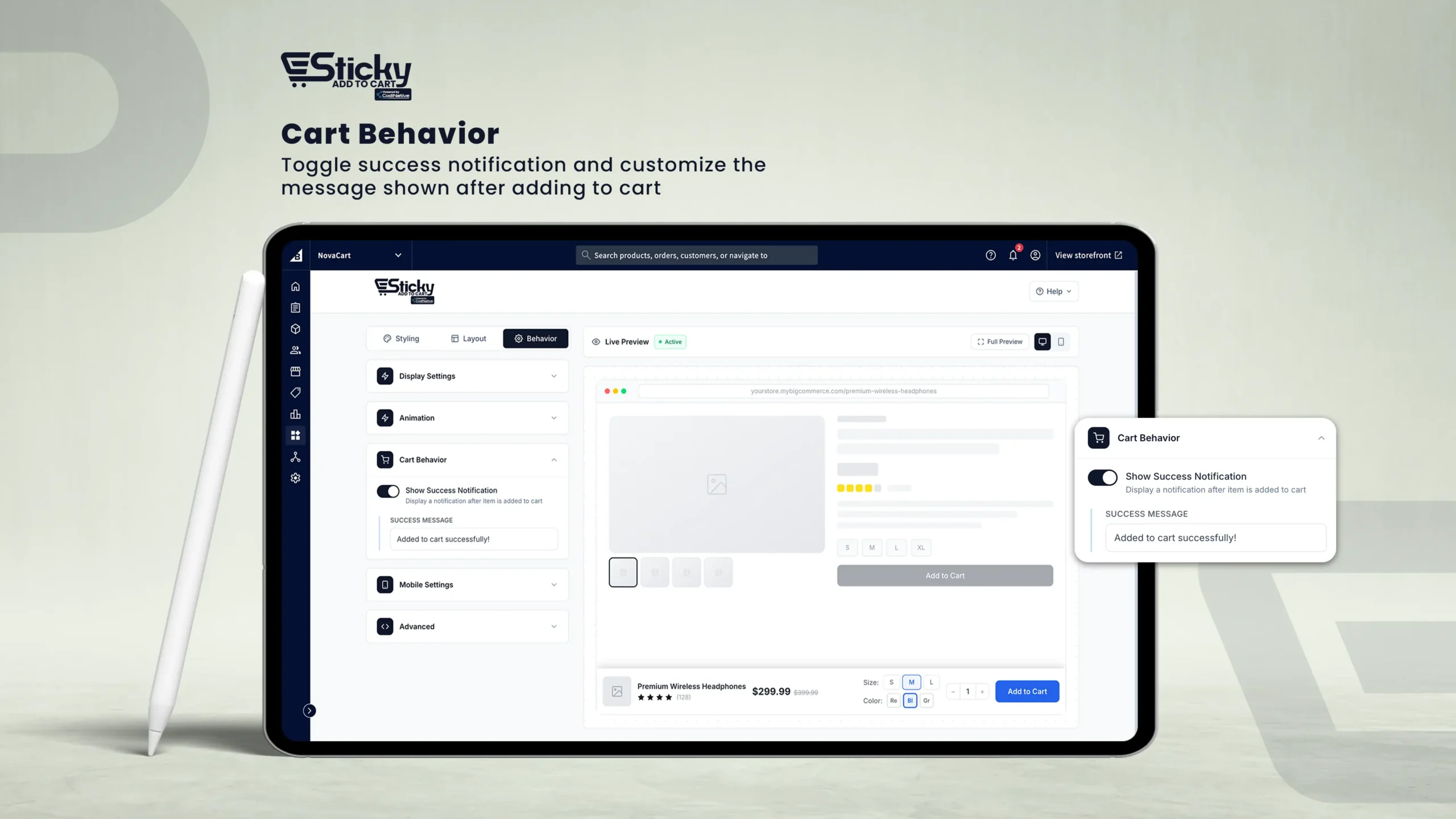
Cart Behavior
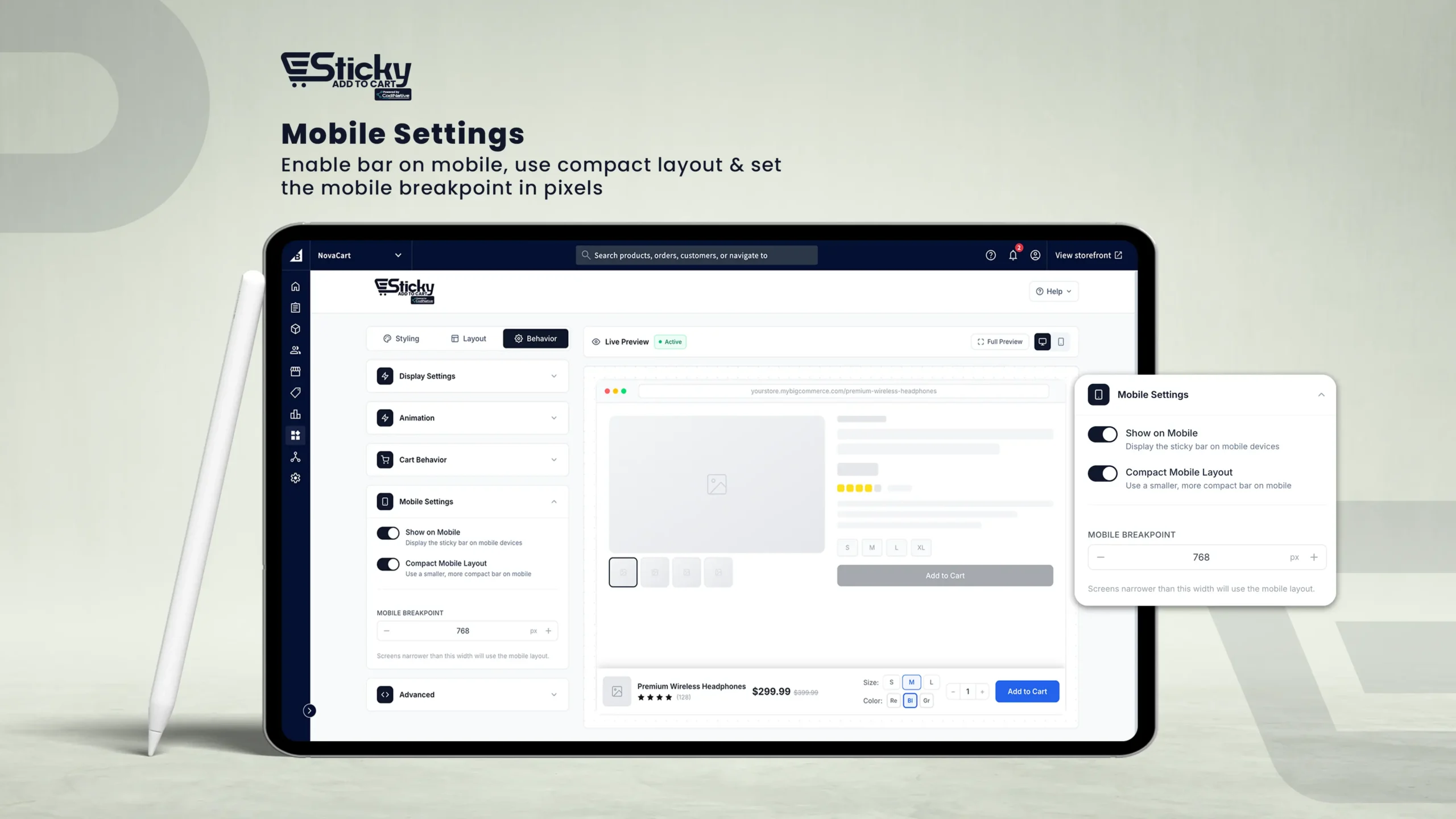
Mobile Settings
Show on Mobile
Toggle off to hide the sticky bar entirely on mobile devices.
Compact Mobile Layout
Toggle on to display a smaller, more space-efficient version on mobile screens.
Mobile Breakpoint
The maximum screen width (in pixels) treated as "mobile." Adjustable from 320px to 1024px (default: 768px).
Live Preview
The Live Preview panel shows a real-time simulation of how your sticky bar will look on a product page.
1. Desktop / Mobile Toggle
Switch views using the monitor and smartphone icons in the preview toolbar. Mobile view simulates a 375px-wide screen.
2. Active / Inactive Badge
Shows whether the bar is currently enabled or disabled based on your settings.
3. Full Preview Button
Opens a full-page expanded preview in a new browser tab.
The live preview uses a sample product ("Premium Wireless Headphones") with placeholder data. Actual product name, price, and images come from BigCommerce automatically.
Saving Your Settings
Whenever you modify any setting, a floating save bar appears at the bottom of the screen.
1. Save Changes
Click Save Changes to apply your settings and publish them to your storefront. No manual theme edits required.
2. Discard
Click Discard to revert all unsaved changes back to the last saved state.
A toast notification will confirm whether the save was successful or if an error occurred.
Make all your changes across the Styling, Layout, and Behavior tabs before saving — you only need to save once to apply everything.
FAQs & Troubleshooting
The sticky bar is not appearing on my product pages.
- Ensure Enable Sticky Bar is toggled on in the Behavior tab and that your settings have been saved.
- If Trigger Mode is "Show on scroll," scroll past the original "Add to Cart" button to trigger the bar.
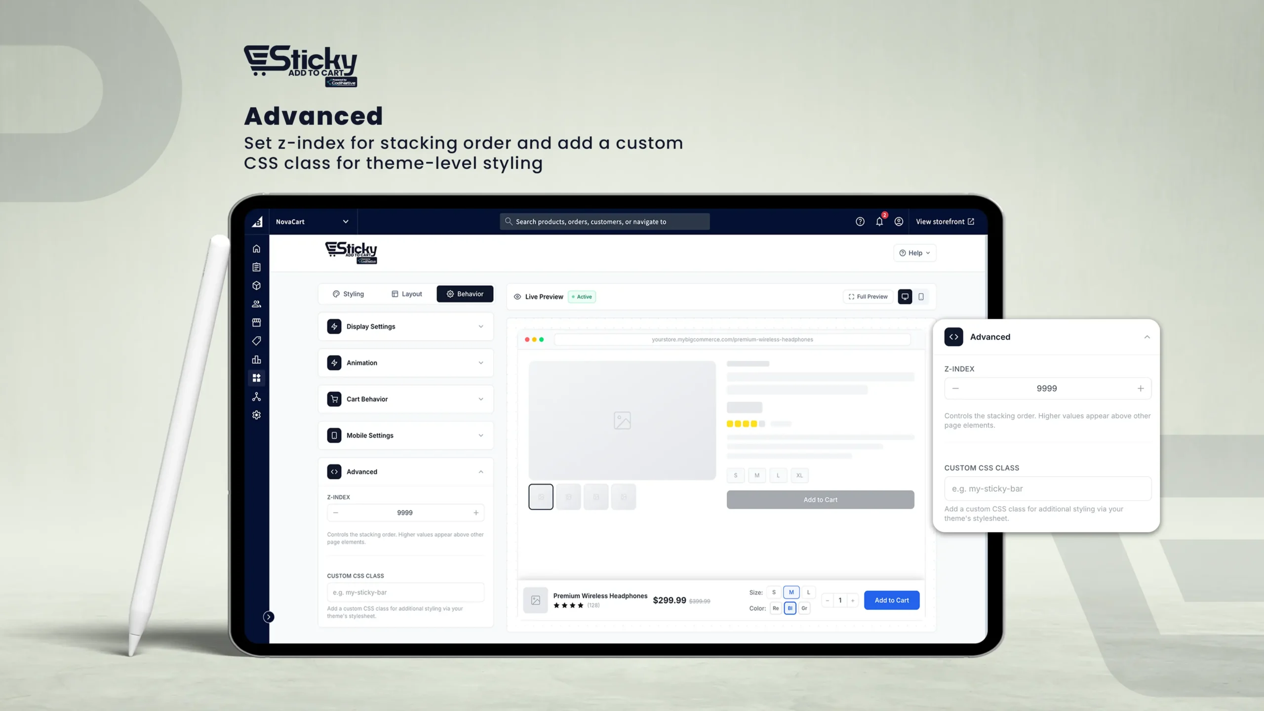
- Check the Z-Index value in Advanced — another element may be covering the bar.
- If Trigger Mode is "Show on scroll," scroll past the original "Add to Cart" button to trigger the bar.
- Check the Z-Index value in Advanced — another element may be covering the bar.
The bar appears but the Add to Cart button isn't working.
- Ensure your BigCommerce product pages are set up correctly and the original Add to Cart button is functional.
- Contact support at info@codinative.com with your store URL.
- Contact support at info@codinative.com with your store URL.
My variant options are not appearing correctly in the bar.
- Option names under Styling › Variant Selector must match your BigCommerce product option names exactly (case-insensitive).
- Options not configured will default to the Dropdown display type.
- Options not configured will default to the Dropdown display type.
The bar is overlapping my store's live chat widget or cookie banner.
- Adjust the Z-Index in Behavior > Advanced to control layering.
- Use the Bar Offset setting in Layout > Spacing to add distance between the bar and screen edge.
- Adjust the Bar Width in Layout > Width & Alignment to add distance between the bar and screen edge.
- Use the Bar Offset setting in Layout > Spacing to add distance between the bar and screen edge.
- Adjust the Bar Width in Layout > Width & Alignment to add distance between the bar and screen edge.
Can I disable the bar for specific products?
The current version applies the bar globally across all product pages. Per-product control is not available at this time.
The bar style doesn't match my theme after saving.
- Set Font Family to Store Default in Styling › Typography to inherit your theme's font.
- Use the Custom CSS Class in Advanced to apply additional theme-specific overrides.
- Use the Custom CSS Class in Advanced to apply additional theme-specific overrides.
Need help?
Reach our team for any questions, issues, or feature requests. Please include your store URL and a description of the issue for the fastest response.